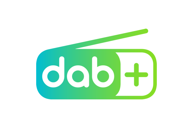
The black and white DAB logo, which has been used for more than a decade on digital radios, is being replaced.
A new green and blue ‘dab+’ logo is being rolled out in international markets to make the marketing of DAB digital radio more consistent. Organisations which promote DAB in each country have historically used their own logos for digital radio.
The new design is based on a “universally recognised radio receiver” and features “modern fonts and a dynamic colour palette”. WorldDAB, the association which promotes DAB digital radio internationally, says this will ensure a consistent brand across all communication channels.
The new DAB+ logo is already being used by manufacturers of home and in-car devices. Broadcasters and car manufacturers are using the new logo, while bodies which promote digital radio in Germany, France, The Netherlands, Belgium and Austria are using the new logo in their marketing.
The logo was designed by broadcaster ARD in Germany and has been used to promote DAB+ in the country since 2017.
Jacqueline Bierhorst, Vice-President, WorldDAB said: “The new DAB+ branding has been incredibly well received and WorldDAB can offer the logo and toolkit to ensure DAB+ has a consistent look and feel across the world.”
“WorldDAB’s recommendation is that the new international logo is adopted by as many markets as possible and that it should replace the previous black and white logo,” said Jacqueline Bierhorst.
The countries which are already using the new ‘dab+’ use DAB+ exclusively or have a large proportion of DAB+ stations.
WorldDAB says the new logo “works hand-in-hand with the Digital Tick Mark and other technical logos.” The new logo will be used in full colour and black and white.
The existing DAB/DAB+ logos were licensed by Philips. A DAB Digital Radio logo used in the UK on early digital radios was created by multiplex operator Digital One.
